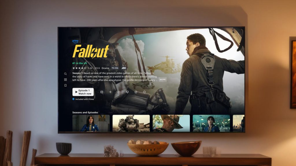
For all its stacked selection of original content, like Fallout, The Boys and Rings of Power, Prime Video has historically pffered a cluttered, confusing and less-than-intuitive layout — especially compared to rivals like Netflix. That changes today as Amazon begins rolling out a new Prime Video UI that, in the company’s words, brings “clarity and simplicity back to streaming.”
The Prime Video redesign starts with a streamlined navigation bar that should make it easier to find your way around. To the left, the bar includes the general categories Home, Movies, TV Shows, Sports and Live TV. Immediately to the right, the nav bar continues with a dedicated tab for content bundled with your Prime membership, followed by sections for add-on subscriptions like Max, Paramount+, Crunchyroll and others. There’s a separate section to add new subscriptions — from Amazon’s more than 100 options — straight from the bar.
Meanwhile, a new “hero rotator” below the bar drills down…
